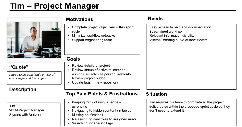
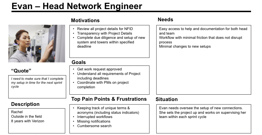
Product management ecosystem
This project contains sensitive information and requires a password for access.
Introduction
NF Tree is a Project Management Tool targeted for Network Engineering teams across the East Coast. NF Tree is broken down into several sections. All sections are associated with a variable known as an NFID – which is essentially the identifier for the entire project.
The sections are listed as follows
1. Project Summary
2. Milestones
3. Tasks
4. Budget
5. Resources
6. Material Tracking
7. Audit Trail
8. Tools
9. Tags
10. Revisions
Each section has its own set of use-cases, and functions and can be used independently or combined as part of the project management process.
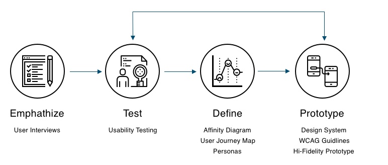
Empathize
User Interviews
We started our UX process by running several user interviews with target users in Networking and Engineering. We were able to get a surface level overviews of the legacy system that users interacted with on a daily basis.
Some of the highlights included
Users felt that each section operated with its own UX guidelines that were not consistent with other screens
Users wanted a system which was not marginally different from their legacy version, but was designed to make them more efficient in their day-to-day tasks
Users felt the existing system had an outdated aesthetic
Users felt the system had good functionality, but forced them to work harder than they should to make the most of it.
Test
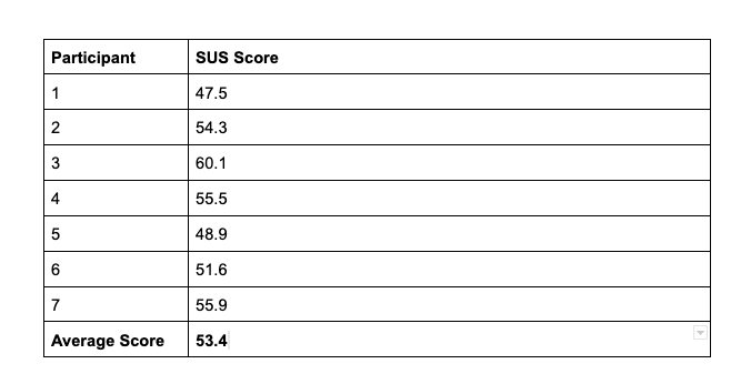
Usability Testing (Legacy System)
Once we were able to gain ample background information on the existing system, we ran several testing sessions with Network Engineers, Project Managers, and Product Owners to understand the usability issues with the current system.
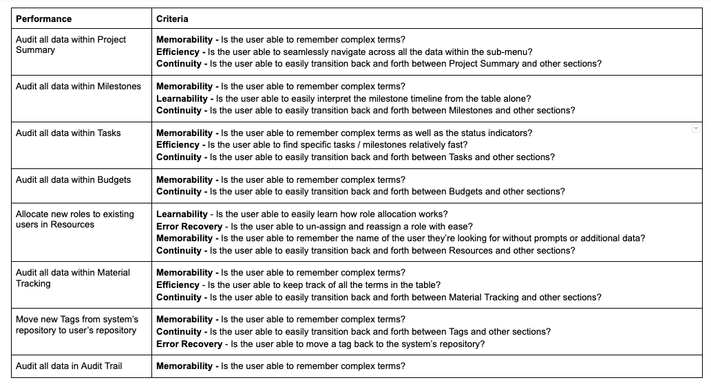
Performance Criteria
We listed one User Task (or performance) for each section in the NF Tree and then defined the criteria for each task based on 5 usability characteristics which include
Memorability – Ability for the users able to remember system process / complex terms
Efficiency – Ability for the users to use the system with efficiency (saving time)
Learnability – Ability for users to learn the system easily.
Continuity – Seamless experience across all sections
Error Recovery – Ability for the user to easily diagnose and recover from errors with help from the systems
This allowed us to discover pain-points related to each criteria based on our observations and the users verbally articulating their issues.
Define
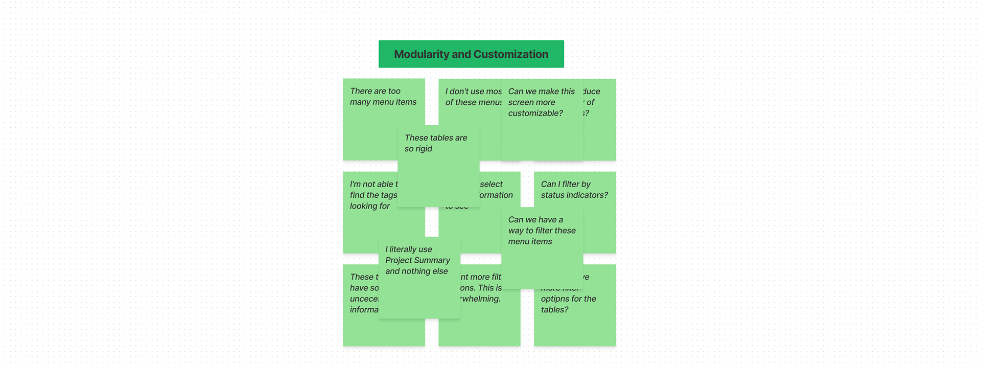
Affinity Diagram
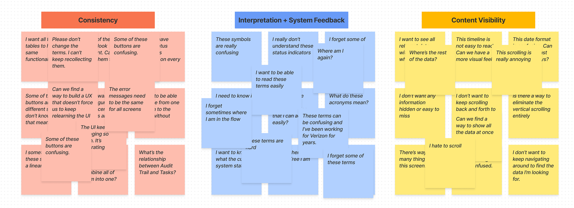
Using the feedback we got from the testing sessions as well as the individual user interviews, we created an affinity diagram based on four categories
Consistency
Interpretation + System Feedback
Content Visibility
Modularity and Customization
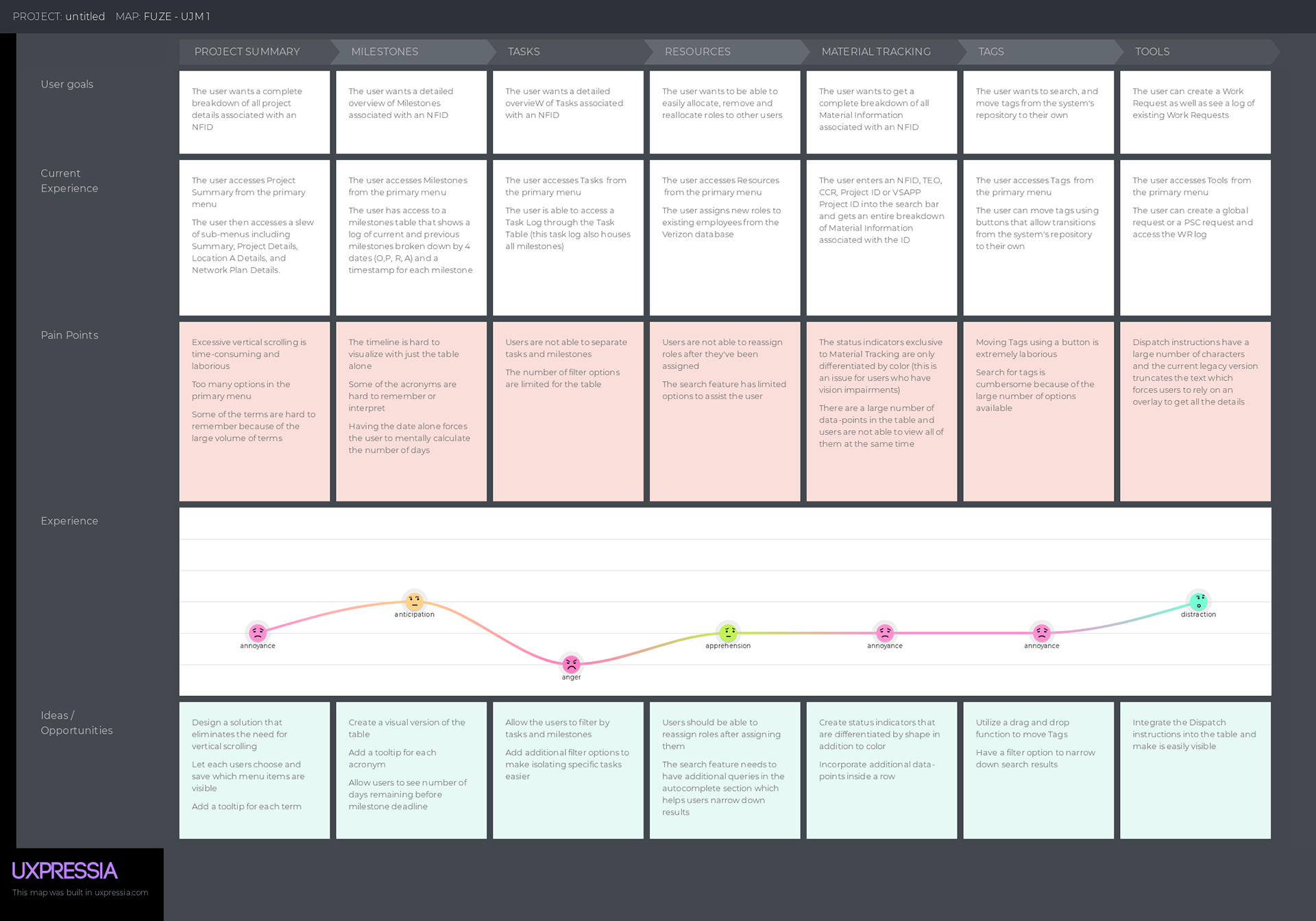
User Journey Map
We created a User Journey Map by highlighting the user-goal, current experience pain-points, user’s emotions, and solutions for 7 out of the 10 sections in the NF Tree (these sections had the most relevant pain-points as per the testing sessions, and user interviews)
Prototype
Design System
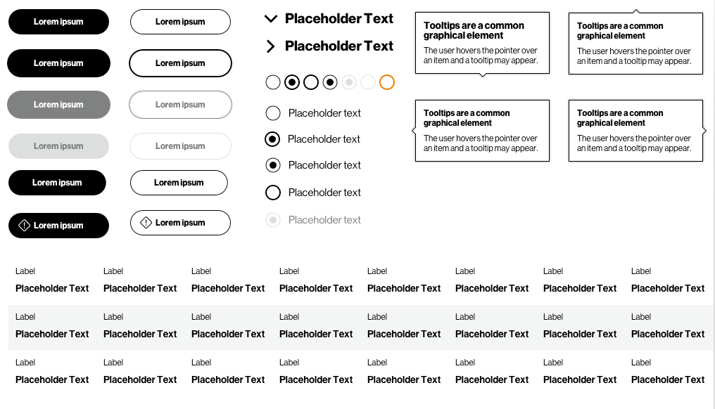
We designed this entire platform utilizing the Canvas Design System which is owned by Verizon. All the legacy screens were designed using a system known as UUI 2.0.
We first migrated all the screens from UUI 2.0 to Canvas utilizing their UIKit and Design Guidelines before working on usability optimization.
WCAG Guidelines
Keeping in line with our philosophy of inclusive design, we ensured that we followed all WCAG guidelines for accessibility standards. One of the core issues users faced with the legacy system was depending solely on color coding for system feedback or indicators when they had varying degrees of color blindness. We fixed this problem by including shapes and word
Hi-Fidelity Prototypes
Modular Menus
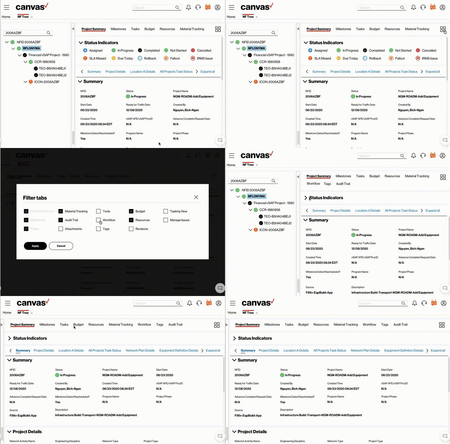
Most users don’t use the same menu items, so it was important to give them the option to selectively filter out menu tabs as per their requirements. This saved both whitespace and reduced cognitive load.
Filtering Tags
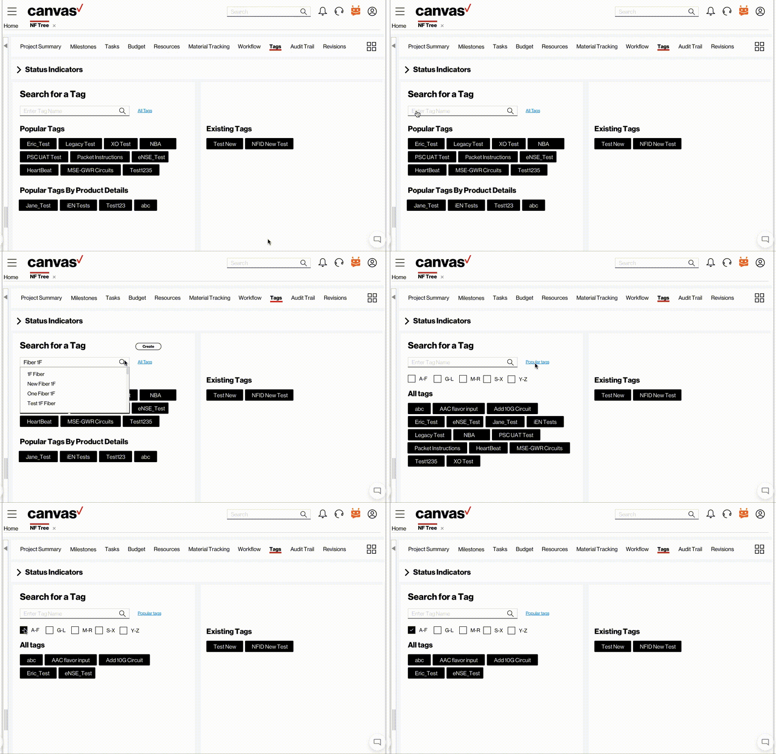
In addition to tab filtering, we also designed a feature where users could filter out search results for the ‘Tags’ section based on an alphabetical range (A-F)…..(Y-Z).
Seamless Navigation
To reduce excessive vertical scrolling we combined anchor navigation and smart-jumps so users can seamlessly navigate from one section to the other with minimal effort. We also utilized a ‘collapse all’ and ‘expand all’ button so users can select which sections they want visible.
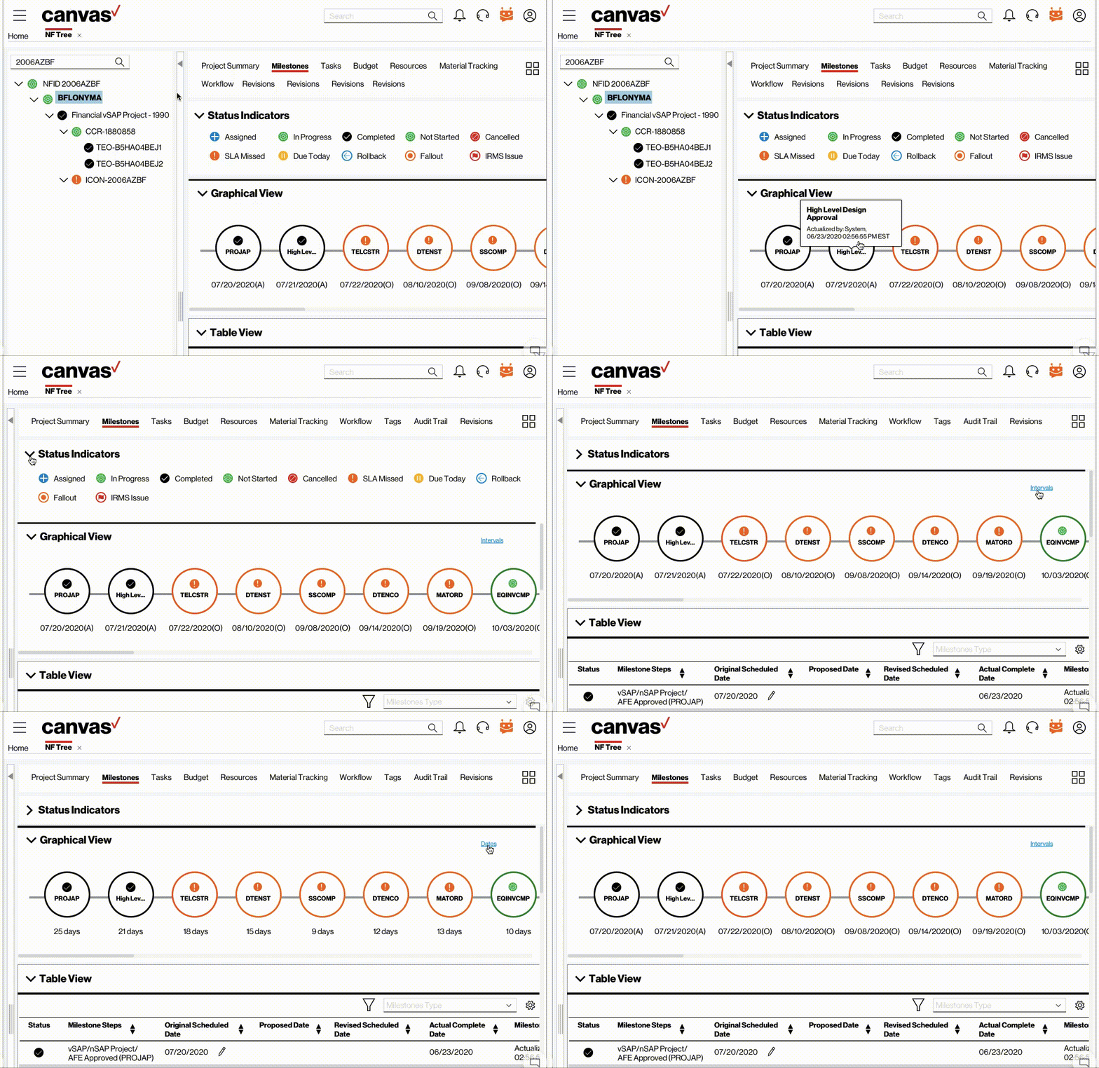
Status Indicators
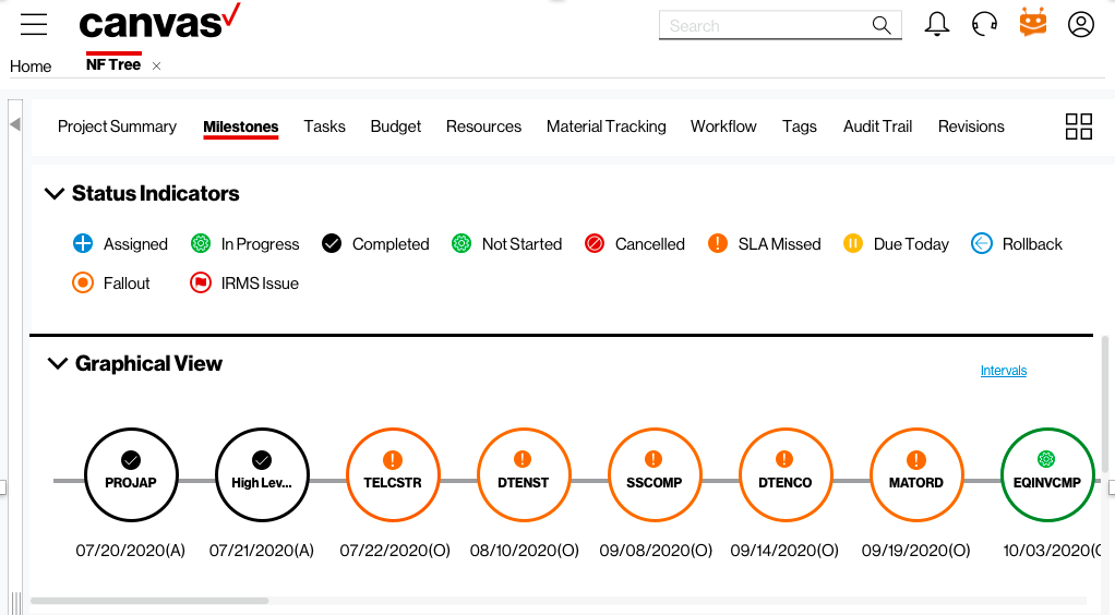
Unlike consumer applications, enterprise apps (especially in companies at the scale of Verizon) have a diverse set of status indicators – each targeted towards specific use-cases and scenarios. It was extremely important for to us to understand each scenario where a status indicator was needed and design one accordingly.
Graphical View of Timeline
The Graphical View for the Milestones focuses on timeline that allows users to keep track of completion dates based on 4 formats – Actual Date (A), Original Date (O), Proposed Date (P), and Revised Date (R)
In addition, some users were uncomfortable with the current date format as they felt they had to mentally calculate the remaining days. As a result, we designed a feature where the user can trigger between two formats – dates and intervals.
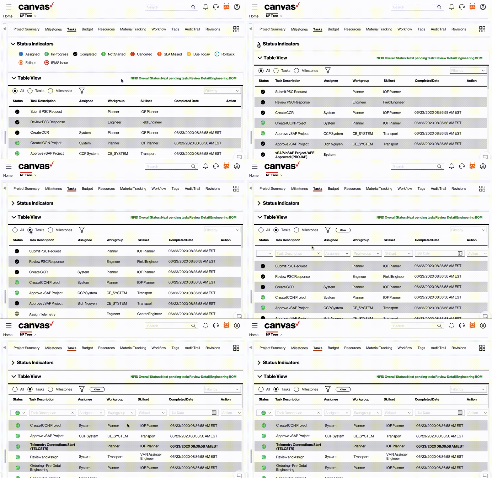
Advanced Filters
The legacy system had limited filter features. This forced users to use existing filters while manually searching for data once those filters were exhausted. We expanded on those filters by adding the option to filter by status, Assignees, Workgroups, Skillsets, Tasks, and Milestones.
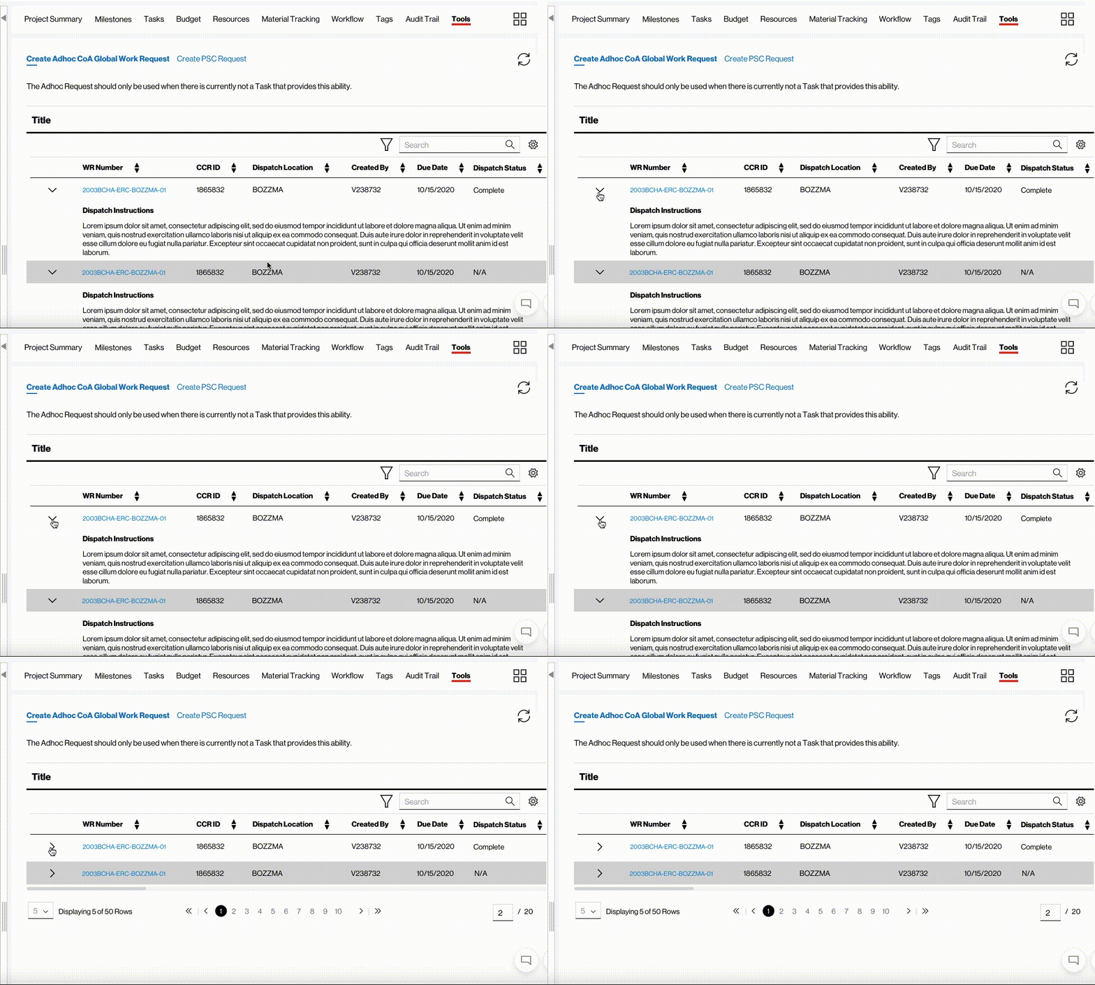
Integrating large cell-data
Some of the cell-data within the tables have characters that range in the hundreds. To accommodate this data, we proposed using an accordion as part of the table row to house the cell-data. The user can collapse / uncollapse the accordion to view the information. This made smart use of whitespace while keeping all the data visible.
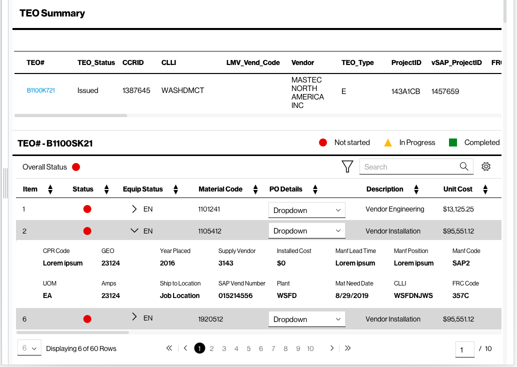
Hidden data
Building on top of our integration of cell-data with large number of characters, we were able to utilize an accordion to house additional cell-data within a table that was secondary in terms of relevance to users. This solved the problem of excessive horizontal scrolling within tables (which users often stated was a major pain-point).
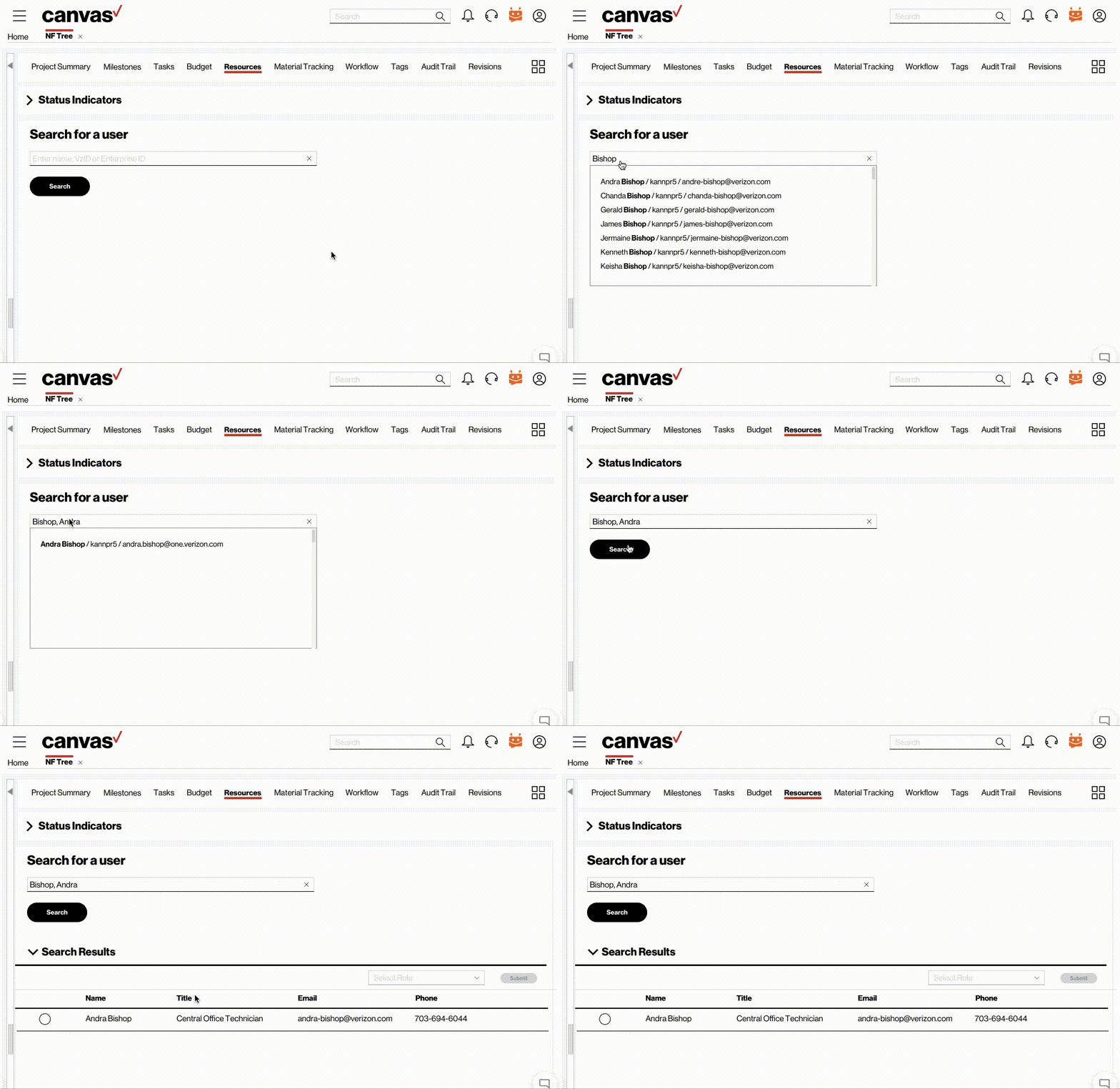
Assisted Search
Users would often forget the emails, IDs or full-names of other Verizon employees and would need to cross-reference them with data they were familiar with in order to get the right search results. We designed an assisted search feature where the user could type the name, ID or email and the auto-search suggestions would display all three variables associated with the query (name, ID and email). This allowed users to easily locate the right result.
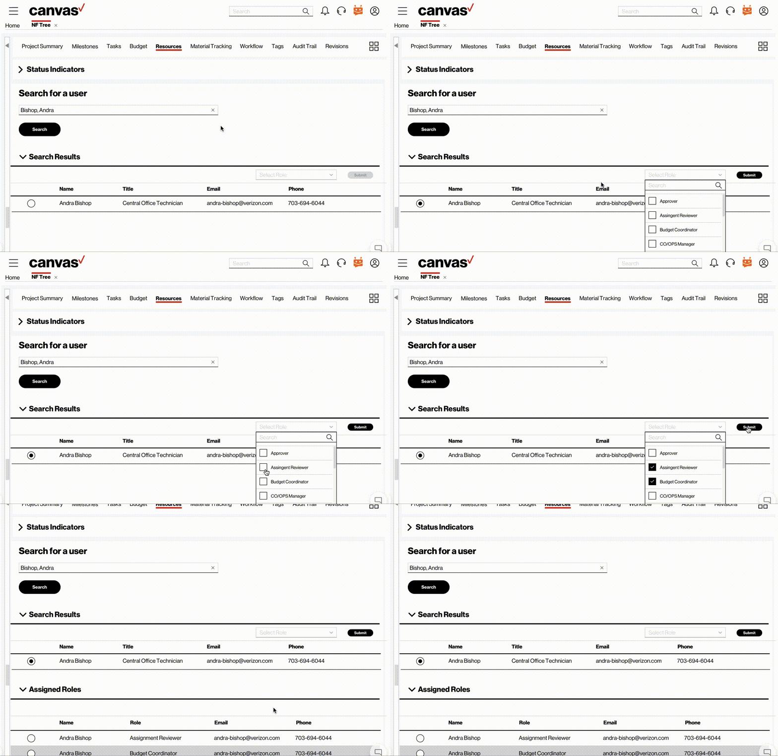
Easy Resource Allocation
The existing legacy system did not make it easy to assign or re-assign roles to Verizon employees. We made the process seamless. In addition, we designed a feature where a user can reassign a role if they made a mistake.
Test
Usability Testing (Redesign)
After the Redesign, we returned to the same users with whom we ran the initial testing sessions with for the legacy systems and mapped out an identical set of tasks with the goal of comparing their feedback and the final SUS score. Some of the feedback included
I love that I can now choose which menu items I can see
This is way less overwhelming than what we had before
This is going to make finishing my job easier
These new status indicators are really helpful
I’m going to use this visual timeline more than the table
This feels like one platform. It’s good
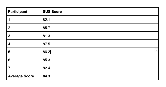
SUS Score
We ran the a post-test questionnaire with the users for the redesign and tabulated the SUS score which came out at 84.3 which is way about the minimal usability score of 64. We were definitely able to marginally increase the usability of the platform.
Conclusion
This was one of the larger projects that we worked at Verizon and this was different from most other ones because the platform was collection of individual sections – each with their own functionality and user experience. Creating a unified system with a singular design objective was a challenge because of the various use-cases. This project further emboldened the need for design consistency within the enterprise applications at Verizon and we definitely used these principles in subsequent projects.
